You devote the morning to shaping a flawless email. That subject line absolutely nails it. The copy sings. When they hit the button, what comes after? Quite often a user lands on a dead end page, leaving your careful planning to go up in smoke.
Powerful email marketing campaigns need powerful landing pages to finish the job. You send your precious traffic to your website’s homepage or a generic product page. This feels like inviting someone to a party but not telling them where the drinks are.
A great landing page acts as the ultimate party host, guiding your visitor straight to the action you want them to take. When your message and data don’t line up, digital campaigns stumble badly. You write a brilliant email promising one thing, but the page they land on feels like a different conversation, which is why less than a quarter of businesses are happy with their email conversion rates.

Table of Contents:
- Ever wonder why landing pages get all the hype
- Make Your Email and Landing Page Work Together
- Building Landing Pages That Truly Convert
- Simplicity is key; focus is everything
- Visuals and Proof: Meet the Twins That Foster Trust
- The Secret Sauce: Figure out your audience, then put every element to the test.
- Here’s the closing remark.
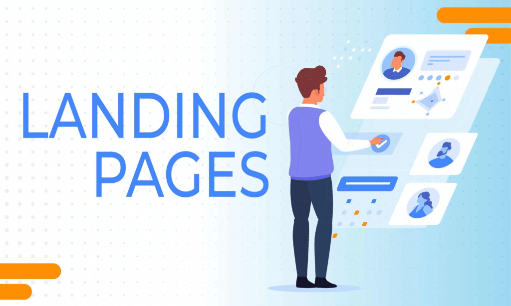
What’s the Big Deal with a Landing Page Anyway?
Think of a regular webpage like a busy department store. It has tons of aisles, different departments, and lots of things to look at. A landing page, on the other hand, is more like a boutique shop with one single, amazing product in the window.
Its job is to focus your visitor’s attention on one specific goal. It might involve joining a mailing list, grabbing a free ebook, or purchasing an item. The purpose‑built page removes distractions, guiding each visitor straight to the desired action.
Unlike your homepage, a good landing page has no confusing navigation, just a clear path to conversion. Your email starts the conversation, creating interest and getting the click. LanderPage is built specifically to optimize landing pages, continuing that exact conversation and then close the deal.
Matching Your Email and LanderPage for Success
Imagine clicking a link for a 50% off blue sweater. You’ll see a group of bright red hats as soon as the page loads. You’d be confused, right? If you find yourself there, you’d probably leave at once.
If the message in your email doesn’t echo the landing page, readers drop off. Consistent design—like keeping navigation buttons in the same spot—prevents confusion and leaves a better impression. Design your landing page so it mirrors the tone and look of the email that led the visitor there.
It involves keeping headlines, colors, fonts, and the main message identical. This consistency in web design tells your visitor they are in the right place. By earning trust right away, it puts people in a comfortable spot to take the next step.
If you skip it, you only muddle things and drive away would‑be customers. You did a great job with the email; don’t let a disconnected page ruin your marketing efforts. When the change flows effortlessly, success follows.
Crafting Landing Pages That Actually Convert
So how do you build on LanderPage a landing page that works as hard as your emails? It is part art and part science! Think of it this way: master a small handful of guiding ideas, and your performance can leap forward.
Start with a Killer Headline
Your email subject line got them to open, and your email copy got them to click. Now your landing page headline has to keep them on the page. You only get a few seconds to persuade them to stay, so make your headline snap attention right away.
Research from Nielsen Norman Group shows that most visitors bounce off a page within ten to twenty seconds. A compelling headline that mirrors the promise of your email is your best defense against the back button. Effective titles hook the reader and don’t let go.
Make sure it’s easy to read, short, and shows the biggest benefit in a flash. Don’t be clever; be direct. Tell them exactly what they will get by staying on your page and why it matters to them.
Keep It Simple and Focused
You might feel the urge to pile extra navigation and content onto a landing page. If you need a reference point, hook up your blog, the About Us page, and any other product pages. Don’t do it.
Every extra link on your landing page is a potential exit. Remember the boutique shop analogy? A clean landing page strips away clutter, so users see only the primary call to action.
Stripping the main menu from a landing page often lifts conversion rates dramatically. Treat your copy the same way, keep it short and easy to scan. Pick straightforward icons, keep the background pure white, and leave generous margins so your key point stands out.
The Irresistible Encourage an immediate response with a call to act (CTA)
Because it sparks action, your CTA stands as the single most vital part of the page. It’s the button that tells people what to do next. Make sure it stands out enough that missing it is impossible, and its point is unmistakable.
Pick vivid shades that stand out against the page’s background so your CTA button catches the eye. Instead of generic text like “Submit” or “Click Here,” use action-oriented language. Encourage folks to press the CTA knowing it’s safe.
Phrases like “Get My Free Guide” or “Start My Free Trial” are much more effective. Position your main cta button “above the fold,” which means people see it without having to scroll. For longer pages, repeat the CTA further down so it is always within reach.
Don’t Get Greedy with Forms
You’re curious about who your leads really are. I get that. But asking for their life story on a signup form is a guaranteed way to scare them away and hurt your lead generation goals.
Every field you add to a form creates friction. A study a few years back showed forms with three fields had the best conversion rates, at around 25%. Just a single extra field can push the rate down quite a bit.
Only ask for the information you absolutely need right now to minimize form submissions friction. You can always gather more details later as you build the relationship. To begin, give us just your name and an email – that’s enough.
Visuals and Proof: The Trust Building Twins
While words shape ideas, the full meaning often hides in what’s left unsaid. The way we look at things and the people we rely on shape outcomes dramatically. Building a visually appealing page that is backed by real social proof is a powerful combination.
Use Images and Videos Wisely
The brain grasps pictures far faster than it decodes words. Whether it’s a vivid photograph, a clean‑looking infographic, or a snappy video, each can pack your message into a moment‑long impression. This variety in content types breaks up the text and makes your page much more engaging.
Putting a video on your landing page often flips the script, and several marketers say it can lift conversion rates by 80 percent or higher. An explainer video can quickly show how your product works or detail the benefits of your service. A well‑crafted picture catches a reader’s eye, then holds it steady.
A word of caution: Heavy media files often drag your site’s loading speed. If a page crawls, it’s basically dead. Data from Google shows that if your page takes longer than three seconds to load, you could lose over half your visitors, so always optimize your media files for speed and avoid overly generic stock photos.
Let Your Customers Do the Talking
You can say your product is the best all day long. Even a simple line gains force when a different voice delivers it. Think of social proof as the marketer’s version of striking gold—simple and powerful.
Including customer testimonials, reviews, or case studies on your landing page builds incredible credibility. People trust other people more than they trust brands, so social proof builds trust effectively. When faced with a new purchase, most of us hunt for past buyers’ opinions to guide the decision.
Seeing that others have had a positive experience with your company reduces risk and makes potential customers feel more confident. The survey reveals that BrightLocal When shopping online, many consumers give a five star review the same credibility as a neighbor’s suggestion. Scatter these testimonials throughout your page, especially near your CTA buttons, because proof builds trust at critical decision points.
The Secret Sauce: Know Your Audience and Test Everything
You can collect all the tips you want, but they won’t work if you skip these two basics. Understanding who you’re talking to and being willing to experiment are what separate good marketers from great ones.
It All Starts with Your Audience
Which people are you trying to connect with? What captures their attention these days? Not having answers to these questions means your marketing strategy is nothing more than a shot in the dark.
When you sketch out a buyer persona, you can hit the right audience every time. A buyer persona sketches the kind of customer you hope to attract. Giving them a name, an age, and interests helps you write good copy and choose visuals that truly resonate with them.
Understanding your crowd lets you speak exactly the way they think. You can quickly forge a link and then convince them to move. Tailored for their situation, your note will strike a chord they can’t ignore.
Never Stop Testing
The typical landing page sees a conversion rate that barely reaches two and a half percent What makes it this low? Because too many people build a page and then walk away, assuming the job is done.
The single best thing you can do to improve your results is to test your landing pages. An a/b test, where you create two versions of a page with one different element, can have a massive impact. Try A/B testing; it’s the shortcut to better performance.
If you want better results, test different headlines, play with the CTA button shade, swap in fresh images, or adjust how long your form is. Businesses that use a strategic approach to testing with regular a/b tests can see their conversion rates skyrocket, sometimes by as much as 300%. Skip the presumption that you know the answer; observe the steps your readers actually take.
| Check this component | Why Trying It Out Matters | Case study |
|---|---|---|
| Headline | This is the first thing visitors read. Your bounce rate could change drastically. | “Our Software Saves You Time” vs. Slash reporting time by half |
| Call to Action (CTA) | If you change the color, the copy, or where it sits, you’ll see a shift in click rates. | Testing a green button versus an orange one, or “Get Started” vs. “Start Your Free Trial”. |
| Images and video footage | A well chosen image stirs the viewer’s feelings. Choosing the right one lifts both trust and engagement. | A clip that puts the product in action side by side. a static product image. |
| Form size measured in characters. | Fewer fields generally mean more conversions, but sometimes more fields lead to higher-quality leads. | Asking only for an email, then comparing it to a broader request. Give us your name, drop your email, and indicate whether your firm is a startup, midsize or enterprise. |
| Crowd approval often nudges a hesitant buyer forward. | When you position a client quote or brand badge right, readers tend to trust you more. | Putting customer badges before the call to action versus below the fold. |
If you’re trying to craft high‑performing landing pages for each promotion, you’ll notice the effort adds up fast. You need to design, write copy, build forms, and integrate everything. Managing it is practically a separate job. If you’ve ever wrestled with tedious steps, you’ll know why these simplifying tools matter. We created LanderPage to give you everything you need without the headache. You can use our drag-and-drop website builder with a full component library and professionally designed website templates so you never have to start from scratch. Our membership includes training to help you get the most out of every campaign. Our LanderForms paired with the LanderPath builder let you piece together a flawless customer path in a few minutes. And as a member you get free, hassle free links to dozens of services. LeadBranch , Validiform , and Online Lead Exchange (OLX) let you swap leads quickly. And then Dial Fusion ramps up the force behind your marketing.
Conclusion
Your email campaigns deserve to succeed. If your landing page stumbles, it’ll hold you back from success. By creating focused, consistent, and trustworthy landing pages, you give your marketing the best possible chance to deliver real results.
You just need to wrap up the chat you began in their inbox. Simplify the process so they’ll gladly say yes. A great site landing page bridges the gap between interest and action, turning clicks into loyal customers.